Color Theory Dreams

This post was a long time coming, but here it is, finally: some brief thoughts on legendary director, Akira Kurosawa.

My favorite of his films, from a narrow sampling, is Dreams (1990). It’s an anthology of separate shorts. Each of its parts shares a little common ground with the other, and  all have the same ghost-story texture.

There is a trail of distinctive trademarks in some of the best Japanese films; things like strong composition, natural weather as part of a scene, and unconventional use of color. If you follow the trail far enough, it will almost invariably lead you back to Akira Kurosawa.

I could try to talk about any one of Kurosawa’s “style things”, but let’s focus on color for a bit. I’ve taken frames from Akira Kurosawa’s Dreams, and added a quick color analysis.

We’ll begin with the anthology’s second segment, The Peach Orchard. Don’t read any further if you want to avoid spoilers.

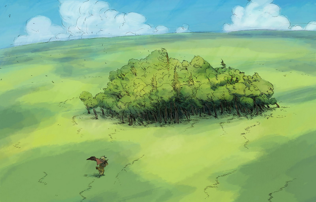
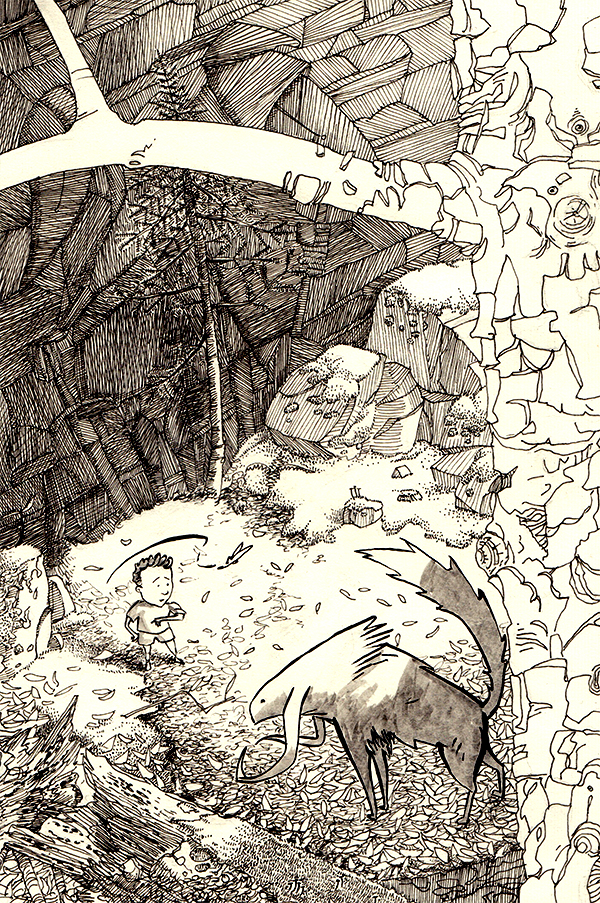
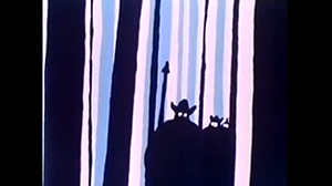
The story opens with a young boy, whose family has chopped down their ancestral peach tree. After examining his sister’s shelf full of dolls, the boy follows a girl dressed in peach-blossom pink into a dark forest.
PeachOrchard-color-01

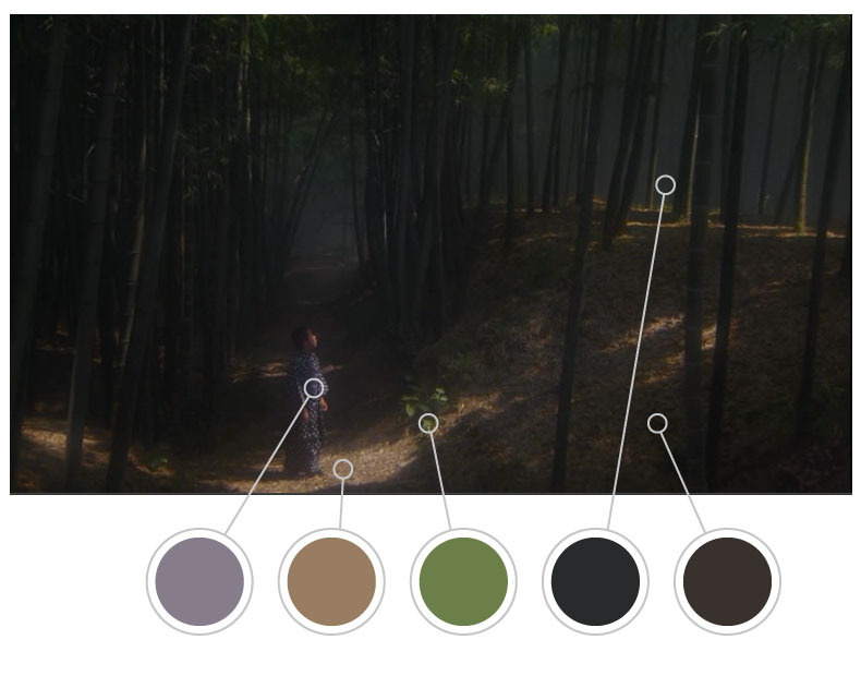
Kurosawa often attached colors to his characters. The girl, symbolizing the spirit of a felled peach tree, is in pink (not shown in the frame above). The boy is dressed in lavender. Both characters are initially set against a background of dark greens, patchy sunlight, and other earthy tones- the forest is deep, dark, and mysterious.

At first, we only catch brief glances of pink as the boy pursues the girl. But then he arrives at a slight clearing in the forest.

PeachOrchard-color-02

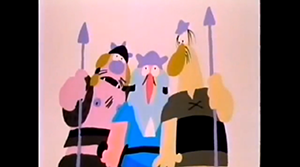
Suddenly, the boy and girl face each other. There is a little more light shining through the lavender fog. Now, pink flowers are scattered on the ground. Kurosawa has linked the girl’s character both with the peach blossoms and with the forest environment, using color.

The girl darts away into the forest’s darkness. The boy follows.

Emerging from the shade of the trees, the boy finds himself facing a terraced hillside, where all the trees have been mercilessly hacked down. Standing in the place of the fallen trees are his sister’s dolls, come to life. The dolls perform a ritual dance.

PeachOrchard-color-03

I don’t really have anything to say about the colors in this scene, but I think they’re really nice. The Peach Tree sets an early precedent for the use of color in this anthology.

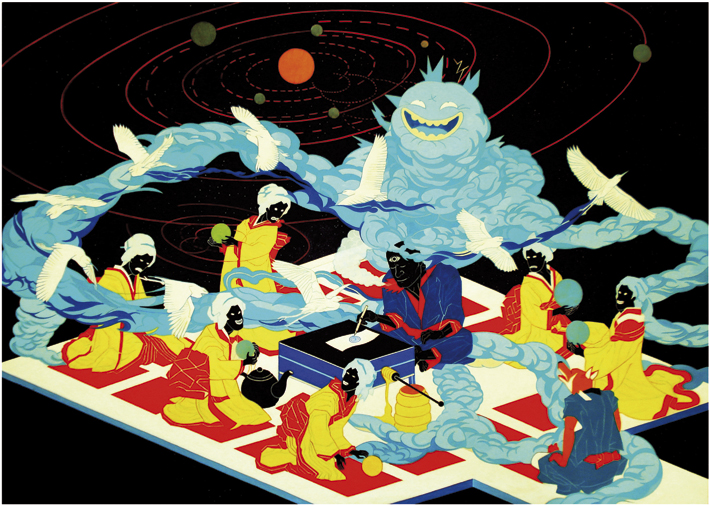
I’d also like to highlight the colors in the segment: The Crows. Named after Van Gogh’s final painting, it follows a student who meets the famous painter (played by Martin Scorsese), and then follows him through a landscape of oil masterpieces.

Crows-color-01 Crows-color-02

It’s a huge pleasure to see Van Gogh’s paintings come to life in this way.

One of my favorite shorts from this collection is The Tunnel, for its sheer evocative power.

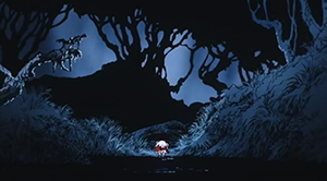
The Tunnel opens with a military-looking man on a road at dusk. He is approached by a savage dog, and retreats into the blackness of the tunnel. As he comes out on the other side, we get to see the beautifully graphical shot below:
TheTunnel-color-01

Melancholy abounds in this landscape of slate blues and blacks. After sensing an undercurrent of menace with the dog, we’re ready to see something frightening. And Akira Kurosawa delivers.

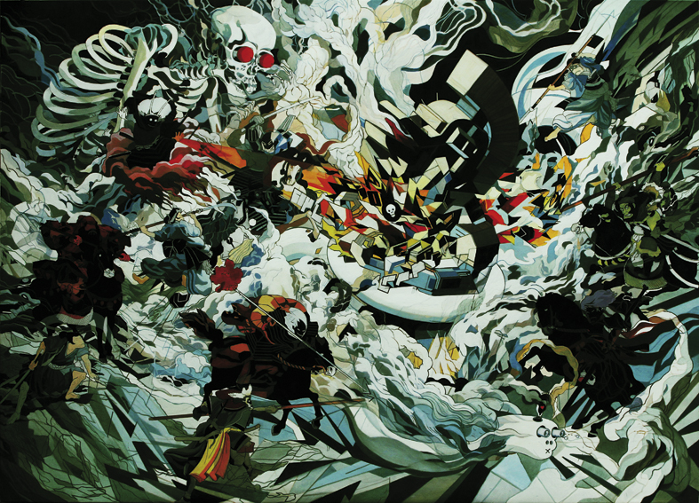
A platoon of dead soldiers marches out of the tunnel towards their commander, the military man.

How do you show an army of the dead? Do you have them staggering around like zombies, with patches of skin falling from their ribs? Do you make them skeletons?

Kurosawa put them in tight ranks, and made them blue.

TheTunnel-color-02

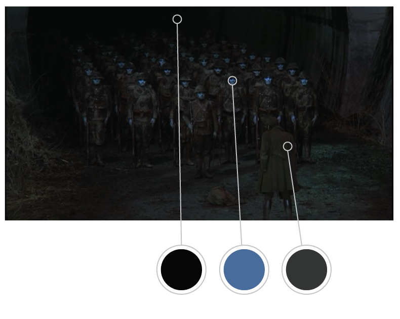
They feel cold, alien, and out-of-touch with human life. As their story unfolds, the audience feels a sympathy for these fallen soldiers that would not have been possible had they been zombies, skeletons, or see-through ghosts.

As frightening as the dead platoon is, The Tunnel isn’t the most chilling story that Dreams has to offer. Let’s talk about The Weeping Demon.
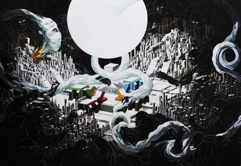
WeepingDemon-color-01

Like The Peach OrchardThe Weeping Demon features a shade of pink- but this time, the pink is the weak glow of the setting sun, through smog induced by a massive nuclear meltdown. Our main character is a man in tattered clothing, wandering through the vast waste alone.


WeepingDemon-color-02

In his travels through the irradiated waste, the man encounters a creature with a single horn in his forehead- a demon who is being punished for sins that he committed before the meltdown. We learn that after nightfall, the horn causes the demon great pain.

We see the pink again, much darker, in a filthy scarf slung around the demon’s neck. We also come across some massive mutated dandelions.

The demon leads our hero to a ledge where they can look down into a deep valley.

WeepingDemon-color-03

Now the pink is back with a vengeance, the bloody centerpiece of a hellish scene. A crowd of demons huddles around three small pools of venomous water, screaming in pain and clutching their horns. The one-horned demon explains that many of them were executives and entrepreneurs- some of the very people who allowed the nuclear meltdown to occur.

This is the judgment that Kurosawa doles out on businessmen and engineers responsible for polluting the earth, and he gets it across using the color pink. That’s amazing.

Moominhobbit

Is there anything so abysmally bad as Peter Jackson’s Hobbit Trilogy? In your conscience, now. Have you ever seen anything so atrocious? Be honest.

I may be alone in my desperate bull-brained hatred of those particular films, but I think everyone has felt the anticipation, hope, excitement and disappointment of having a beloved book slashed to ribbons and stitched into a patchwork quilt of cool mediocrity. For some, it’s the Hunger Games. For others, it might be Frankenstein.

It doesn’t matter what your book was. When you saw it pale and sterilized on the silver screen, you knew that something had gone horribly wrong.

What happened?

I remember my mom used to make covers for some of her books. She covered up the original illustrations with plain white paper so she wouldn’t have to look at them. When I asked her why she did it, she said something like this:

“I don’t like the picture of (the main character). That’s not how I picture her in my head.”

The commercial artist who did that cover illustration had messed something up. He or she got it wrong. There was a disconnect between the vision that the author projected into the reader’s mind and the vision that the illustrator had executed.

And this happens all the time. Authors are painters with words, and unless an artist is intimately familiar with those words, how can they visualize them authentically? The reader and writer are very close, and illustrators have to wedge themselves in, somehow.

So why bother with illustrations at all?

Really, some books should not be illustrated. Non-fiction should not be illustrated. Autobiographies of politicians should not be illustrated. But sometimes, artists can show you something in a new way.

5Tove Jansson, The Hobbit, 1962

Pictured above is one of Tove Jansson’s illustrations for the Hobbit. These caught me off guard this morning, and I had to look for more of them.  Tove Jansson was a Finnish illustrator and storyteller, best known for her stories about the Moomins, a lovable race of hippo people.

title-alternativ swedish-hobbit-illustration-1962-12

They’re so free, loose, and fun! This is appropriate, because the Hobbit is a fun book. It’s chock-full of songs, dancing, and feasting.

finnish-hobbit-illustration-1973-26 de398dda760357e19042359fbaa2d872

Tell me this, Peter Jackson. Which is a better interpretation of the Hobbit: your high-definition, 30 frames-per-second slaughter-action-fest, which altogether runs for nearly 9 hours, or the picture below?

tove-jansson_hobbit

My apologies to people who like the Hobbit movies. I just get so mad sometimes.

Bonus! Here’s one of Tolkien’s original artworks for the Hobbit. See more here.

tolkienart3

J.R.R. Tolkien, The Hobbit, 1936

Mr. Stanley Kubrick

I am proud to be a creator.

As I was reading this morning about the directing techniques of Stanley Kubrick, I felt a newfound pride swelling inside me. Here was a man who tried and failed, thousands (if not millions) of times, in a near-endless battle to achieve perfection. Here was a master, someone who drove his work beyond the boundaries of excellence and into the realm of genius.

Humans are flawed, and I’m the first to admit it. I can’t draw straight lines. I can’t light my scenes with the accuracy of a photograph. I am a human, and that means constant mistakes in my work and my personality. I will never sit down at my desk and produce something perfect on the first try.

I am not like my computer, which can always draw straight lines, every time, tirelessly, or always render a scene with accurate lighting. Knowing this hurts me; it feels like lifting weights but never getting any stronger. I am no Kubrick.

Nonetheless, Kubrick makes me proud of my humanity. I’m not a creator like him.  But like him, I am a creator.

yeahpaintingstyle_barrylyndonBarry Lyndon, 1975

Kubrick’s 1975 film, Barry Lyndon, is one of my favorite movies. I was first motivated to watch it by one critic’s suggestion that “every scene was like a painting”. Their appraisal was accurate: every scene in the film was riveting in composition, color, and lighting. The story cleanly encapsulates a man’s life and struggles in the space of three hours. It is the perfect film.

How did he do it? How did Kubrick manage such a massive undertaking with any level of mastery?

vlcsnap-2010-12-11-14h39m36s28 barry_lyndon_1280x800_64186Barry Lyndon, 1975

It is both a great comfort and a great challenge to me, knowing that Kubrick made mistakes. The difference between his work and mine is that he never allowed his mistakes to appear in the final product- he worked through them, no matter how difficult. This meant hours upon hours of painstaking thought and labor. It meant he only completed 13 feature-length films in his career.

However, it also meant that each one of those 13 was a masterpiece. It meant that Kubrick will go down in history as one of the greatest directors ever to call a retake.

There are several artists like Kubrick, whose work is irreproachably brilliant. The first one that springs to mind is Rembrandt (only because I recently got the chance to see some of his first editions in person). But there are outstanding masters in every field of the arts. They are like aliens, supernaturally gifted with creative ability. Is this true? Are some people just different, capable of genius from birth?

N86H7UD

6a0120a8545b6a970b01a3fcd536c6970b-piBarry Lyndon, 1975

It is not true. Kubrick made mistakes. It was his ability to work through his own mistakes that made him a genius.

All of the great masters were (and are) humans. They were (and are) all fundamentally flawed. None of them could draw a truly straight line.

barry-lyndon-landscape barry-lyndon-duelBarry Lyndon, 1975

We know instinctively that nothing perfect comes from a flawed source. The root defines the fruit. Yet this natural law is defied when humans like Tchaikovsky, Steinbeck, and Kubrick composed a symphony, wrote a novel, or directed a film that still stands straight and tall in a gray crowd of mediocrity. They have done what a perfect computer will never do. They brought what is flawless out of what is flawed. They drew a straight line, and in the process it took on a quality of humanity; it became something more than perfect.

Visual Oddysey

Ulysse Malassagne!

Lesser artists cringe, turning paint-stained pants away from the dark figure in the doorway.

Ulysse Malassagne!

He enters, returned after a long journey to find his banquet hall full of miscreants and vagabonds who merely pose at craftsmanship. He bares a shining sword. No one says a word. A few ragged beggars begin to file toward the door.

Malassagne!

I’m not sure how to transition from that gripping intro to the normal blog post. Really it was just a dumb joke based on the fact that his name sounds like Ulysses and his blog/portfolio is called Oddysey. Just forget it.

Ulysse Malassagne is an artist and storyteller from France with a wonderfully loose and imaginative style.

Malassagne_New Companions_2010Ulysse Malassagne, New Companions, 2010

He’s perhaps best known for writing and illustrating the graphic novel series Kairos, which was launched with a very cool book trailer (animation directed by Malassagne).

KAIROS Trailer from Studio La Cachette on Vimeo.

The first two volumes of Kairos are currently available, with one more to come.  To my shame, I don’t have the money to buy any of them. Hopefully I’ll scrape together some cash later this summer.

Malassagne_Kairos_2013Ulysse Malassagne, Kairos Tome 1, 2013

kairos2

Ulysse Malassagne, Kairos Tome 2, 2014

Malassagne_KairosPage_2013

Ulysse Malassagne, Kairos Tome 1, 2014

There’s been a movement in the past few years towards what I’ll call the “Really-Fast-And-Quick-And-Sort-Of-Crap” school of drawing, embodied and largely inspired by the show, Adventure Time.  I have a beef with this school simply because (1) it has so many followers, and (2) it’s not visually rich.

But I love loose artists. Loose doesn’t necessarily mean “Sort-Of-Crap”, any more than it indicates a lack of effort, and Ulysse Malassagne is a prime example of a loose style, executed well.

Malassagne_TheHouse_2010Ulysse Malassagne, The House, 2010Malassagne_Poster_2013Ulysse Malassagne, Poster, 2013

Looking through Malassagne’s work, I get a sense of his genius for character, setting, and tone. As he tells stories that can only be told with pictures, his work takes on some of the rampantly original flavor of Miyazaki. If we were to cut this guy open, we might find liquid creativity in the place of viscera.

Malassagne_voeux_2013Ulysse Malassagne, Happy New Year, 2013  Malassagne_The Soul of the King_2009Ulysse Malassagne, The Soul of the King, 2009
Malassagne_Searching the Plain_2010Ulysse Malassagne, Searching the Plain, 2010

Malassagne_Jade_2013Ulysse Malassagne, Jade, 2013Malassagne_Anaëlle et la gouvernante_2010Ulysse Malassagne, Anaëlle and the Governess, 2010


Short Ride in a Kitsch Machine

Parched and bored, I staggered around the Internet Desert, looking for something to spark my interest. The morning was only beginning, and already I was staring into the white abyss of a google image search with caffeinated blood an empty skull.

“Pink Panther,” I typed into the search box.

I like the Pink Panther. He’s cool under fire. Imperturbable and Inimitable. The pink incarnation of sangfroid.

He also has a sweet car; have you ever seen it?  It looks like this:

JayOhrberg_Pink-Panther+13 JayOhrberg_Pink+Panther

Jay Ohrberg, Pink Panther Car

Clicking on this image, I found myself drawn into an oasis of polaroid photos and retro cars. What was this website?

WWW.JAYOHRBERG.COM, the URL said.

WWW.JAYOHRBERG.COM, nearly every one of the pictures insisted with their enormous watermarks.

Who is this Jay Ohrberg? Apparently he makes cars. And he’s very, very good at it.

JayOhrberg_Bat+skiboat JayOhrberg_Bathtub+car JayOhrberg_Black+Moon+Rising+1 JayOhrberg_Calico+Surfer

There’s something wonderful about Jay’s work. It’s over-the-top, painfully corny, and reeks of nostalgia. It’s silly.

JayOhrberg_Flintstone+4 JayOhrberg_Mini+Too+Much

As I clicked through Jay’s enormous (and not very user-friendly) image gallery, I began to wonder about the people who had commissioned these cars. He had done work for several major films, including the Terminator, Ghostbusters, and one of the Batman pictures. There were also a lot of tribute cars, commissioned by the dedicated fans of Elvis, Marylin Monroe, James Dean, etc.

Then I began to wonder about the man himself.

He didn’t have “taste”. The cars are loud, maybe even obnoxious. Very low-brow. He had a “friends” page on his website, and it was just photos of him posing with people. Really? No one does that, not on a professional website. He wasn’t an artist in the true sense of the word, right?

Right?

JayOhrberg_Monkee+mobile+post JayOhrberg_Pinocchio JayOhrberg_Sand+Draggin JayOhrberg_The+Invader

To dismiss Jay’s work would be a mistake. As tacky as some of his vehicles are, each one of them is charming. There’s something admirable about Jay; there is always something admirable about people who are dedicated to doing what they love, and doing it well. He probably brings other people a lot of joy too.

JayOhrberg_Jay+with+Marilyn+copy

Keep it up, Jay Ohrberg!

Freebie Wednesday!

NateTaylor_journeystone2_04 NateTaylor_journeystone2_06 NateTaylor_journeystone2_08 NateTaylor_journeystone2_09

The word “free” is the cocaine of the English Language.

“FREEEEE?” You say, drooling a little. “Yes,” I respond coolly. From the dark folds of my vast trenchcoat I produce a box, which I deftly unlatch. It snaps open, and inside you see…

Journey Stone Books I & II, now FREE to download!

Get ’em while they’re hot at this link. Enjoy!

Stop Motion Monday

I realize that it’s not (technically) Monday. In reality, it’s Thursday. Or maybe even Wednesday.

Minutiae aside, I’ve brought you four awesome animated films with three common threads.

Common Thread #1: you probably haven’t seen them (with the exception of #4, maybe).

Common Thread #2: They all employ some form of stop motion.

Common Thread #3: Each one has a terrific storyline.

#1: The Fool of the World and the Flying Ship (1990)

Deep in the heart of Russia, there was a man and a wife living with their three sons. The two eldest sons were lazy and avaricious, but the youngest was good-hearted and honest.

After helping an elderly man, the youngest son finds himself embarking on a journey that will take him far from home.

FoolOfTheWorld_05 FoolOfTheWorld_01

This great short film aired as an episode in the children’s TV series “Long Ago and Far Away”, and was guest-narrated by David Suchet (the show’s regular narrator was none other than James “No Luke, I am your Father” Earl Jones). I’m definitely checking more episodes out later, I hear they do a mean version of Abel’s Island.

FoolOfTheWorld_02 FoolOfTheWorld_03

If it only for the colorful characters, The Fool is worth a watch. But it also has a timeless and engaging story. Check out Part 1 here!

#2: When The Wind Blows (1986)

Based on the graphic novel by Raymond Briggs, this cute, fun, romping film follows a darling British couple as they learn to cope with the aftermath of a nuclear strike.

Briggs_WhenTheWindBlows_01 Briggs_WhenTheWindBlows_02

There are some films I watch when I need to hit rock bottom. This is one of them. What’s so great about it? I mean, apart from the opening song by David Bowie.

The message is incredibly powerful, and the story is as human as they come. It’s also a really cool use of traditional cel-animated characters on top of a stop-motion background.

Briggs_WhenTheWindBlows_05 Briggs_WhenTheWindBlows_04 Briggs_WhenTheWindBlows_03

If you want happy fluff, move along. The Snowman (1982) is a friendly option, if you still need a Raymond Briggs fix without the dose of depression.

#3: Krabat (1978)

Krabat: The Sorceror’s Apprentice comes in like a lamb and goes out like a lion. When I first ran across this film in a Youtube search for Czech animation, I was skeptical. Were the characters a little too childish? Or maybe the scenes felt a little flat? My criticisms quickly dropped as I found myself drawn into a story that was as enchanting as the Sorceror’s grimoire.

krabat9krabat krabat_03

Do yourself a favor and check out this tale of friendship, love, and black magic. It’s also a fine example of cutout animation.

#4: Peter and the Wolf (2006)

Do you like Russia? Do you like Tchaikovsky? How about close encounters with ravenous beasts of prey?

PeterAndTheWolf_03 templeton-peterwolf SuzieTempleton_PeterandTheWolfIf you answered “yes” to any of the above, you simply must watch Peter and the Wolf, a visually stunning musical film directed by animation master Suzie Templeton. It features gorgeous sets and icy blue Russian eyes.

That does it for my little list! What are your favorite stop-motion films?

What the Jon say?

Jon Fox- what is your sound?

Probably something cataclysmic and jaw-dropping.  Check out these eye-numbingly fantastic pieces.

RGB Emporers Dream -oil on canvas- 200 x 140 cm -2010Jon Fox, Emperor’s Dream, 2010

RGB Portal -oil on canvas- 200 x 140 cm -2010Jon Fox, Portal, 2010

RGB Scarecity -oil on canvas- 210 x 140 cm -2010Jon Fox, Scare City, 2010

RGB Solar Visions -oil on canvas- 120 x 80 cm -2011Jon Fox, Solar Visions, 2011

To see more of Jon’s work, visit his website at www.soulofagiant.com

Composition: Who Cares?

“Yeah, I remember those pictures. I remember looking at them as I listened to the music.”

Mom was sitting across the table from me, reminiscing.

The album in question was the Point, by Harry Nilsson. Its accompanying booklet, with tiny grayscale illustrations, was spread out in front of me.

“I didn’t really like the illustrations. They were actually kind of scary,” she went on.

She was right. Gary Lund’s illustrations for the vinyl sleeve of Harry Nilsson’s 1971 concept album were not exactly inviting.  But they grabbed me nonetheless.

Gary Lund the Point_01 Gary Lund the Point_02

Gary Lund, Sleeve art for The Point, 1971

These are some of the most beautiful panels I’ve ever seen, and I’ve been poring over these since Saturday.  Is it the amazing draftsmanship at work? No. Is it the use of tasteful colors? Nopers.

Composition.

Look at that composition! These loose, energetic panels are actually playing together, leaking into each other, and letting the story flow organically. It makes for a visual experience that even my Mother, initially turned off by the art style, couldn’t resist.

Gary Lund the Point_03 Gary Lund the Point_05 Gary Lund the Point_04

Gary Lund, Sleeve art for The Point, 1971

What a wild, wonderful way to present an album! It’s so much fun to let your eye wander over the landscape of broken frames, vibrant colors, and funky shapes.

Sleeve art like this almost entirely supplants the movie, as fond as I am of its cheap lovableness.

Gary Lund the Point_06 Gary Lund the Point_07

Gary Lund, Sleeve art for The Point, 1971

Gary Lund shows us just how glorious it can be, breaking the rules and thinking outside the visual box.

This is the sort of thing that happens all the time with sleeve art- the fact that there’s no “standard” for this marginal application of illustration really frees artists up.

What’s your favorite sleeve art or album cover?

Double Feature Friday

I’ll bet you pickles to nickels you haven’t seen either of these very cool animated movies. Go ahead, prove me wrong.

The first, and the one I’m really into, is Grendel Grendel Grendel. It’s Australian in origin, and is that country’s second full-length animated feature.

1981 australian animated film directed by Alexander Stitt

1981 australian animated film directed by Alexander Stitt

1981 australian animated film directed by Alexander Stitt

1981 australian animated film directed by Alexander Stitt

Grendel Grendel Grendel (1981), directed by Alexaner Stitt,is a romp in the mysterious world of proto-medieval Scandinavia. The main character is a lovable and sophisticated green creature, Grendel from the epic poem Beowulf.

1981 australian animated film directed by Alexander Stitt

1981 australian animated film directed by Alexander Stitt

What makes this one so great? The humor is goofy, the art is lush and vivid, and the story builds itself methodically and intelligently. This movie sits squarely between juvenile and adult storytelling, having fun with the silly, colorful characters while also striking deep chords of loneliness and curiousity in Grendel’s personal life.

1981 australian animated film directed by Alexander Stitt

1981 australian animated film directed by Alexander Stitt

1981 australian animated film directed by Alexander Stitt

1981 australian animated film directed by Alexander Stitt

It also stars Peter Ustinov as the voice of Grendel- how can you beat that?

The second film is even a little further off the deep end. Angel’s Egg (1985), directed by Mamoru Oshii, is one long animated question.

Screen Shot 2014-04-23 at 8.57.49 PM Screen Shot 2014-04-23 at 9.11.13 PM Screen Shot 2014-04-23 at 9.07.29 PM Screen Shot 2014-04-23 at 9.00.23 PM Screen Shot 2014-04-23 at 9.18.39 PM

In a hauntingly beautiful 70 minutes, a young girl and a soldier wander a eerie landscape locked in eternal night. The plot, featuring mystifying references to the Biblical Flood, centers around a mysterious egg which the girl carries.

Screen Shot 2014-04-23 at 9.18.44 PM Screen Shot 2014-04-23 at 10.02.15 PM Screen Shot 2014-04-23 at 9.39.27 PM Screen Shot 2014-04-23 at 9.23.42 PM Screen Shot 2014-04-23 at 9.20.18 PM

If slow pacing makes a movie painful to watch, this is the Spanish Inquisition of animated films. But don’t let that stop you- it certainly has its moments. I would love to hear what you think it means, because even after watching it a second time, I’m still absolutely in the dark.

I’m always on the hunt for obscure animated classics! What are some of your favorites?